
5 Modern Bathroom Colour Palettes for 2026
Table of Contents
- Palette 1: Earthy Neutrals and Warm Tones
- Palette 2: Nature-Inspired Green Palettes
- Palette 3: Blue Hues for Serenity
- Palette 4: Terracotta and Clay Accents
- Palette 5: Dark and Moody Colour Schemes
- Modern Bathroom Designs for Small Spaces
- Best Paint Colours for Small Bathrooms
- Bathroom Wall Panel Colour Trends for 2026
- Frequently Asked Questions
Last Updated: September 16, 2026
Palette 1: Earthy Neutrals and Warm Tones
The most requested bathroom colour palettes for 2026 lean into earthy neutrals: oatmeal beige, clay pink, warm greige and soft taupe, and these bathroom colour palettes are shaping the year's biggest schemes. This guide from Wetwall Wonders breaks down five schemes worth committing to, plus how each behaves on real walls in a small, steamy room.
Oatmeal Beige and Clay Pink in Practice
Pair oatmeal beige as the dominant wall tone with clay pink on a single vanity splashback or behind a mirror. Both sit at similar saturation levels, so neither fights the other. Keep chrome fixtures minimal; brushed brass or matt black hardware suits these powdery tones better.
Palette 2: Nature-Inspired Green Palettes
Green has the longest shelf life in this list. Sage green, olive and muted eucalyptus read as contemporary without chasing a trend cycle, and coordinate unusually well with natural wood and organic textures.
Sage, Olive and How to Ground Them
Sage works as a full-wall colour in small rooms because its grey undertone keeps it from closing the space in. Olive is bolder and better used on a single accent wall or inside a shower enclosure, where it reads as a deliberate feature.
- Sage green: full walls, pairs with white ceramics and light oak
- Olive: accent walls, shower surrounds, pairs with brass
- Eucalyptus: ceilings and half-height panelling, pairs with grey stone effects
Palette 3: Blue Hues for Serenity
Soft mid-blues remain the safest route to a spa-like bathroom. Aquas and powdery blues lower the visual temperature of a room and pair naturally with white, chrome and pale grey, which is why they dominate hotel bathrooms.
Palette 4: Terracotta and Clay Accents
Terracotta and rust are the warmest option here, and the one most likely to divide opinion. Used sparingly, clay pink and rust accents add a Mediterranean warmth no neutral can replicate. Used across a whole room, they overwhelm a compact space.
Palette 5: Dark and Moody Colour Schemes
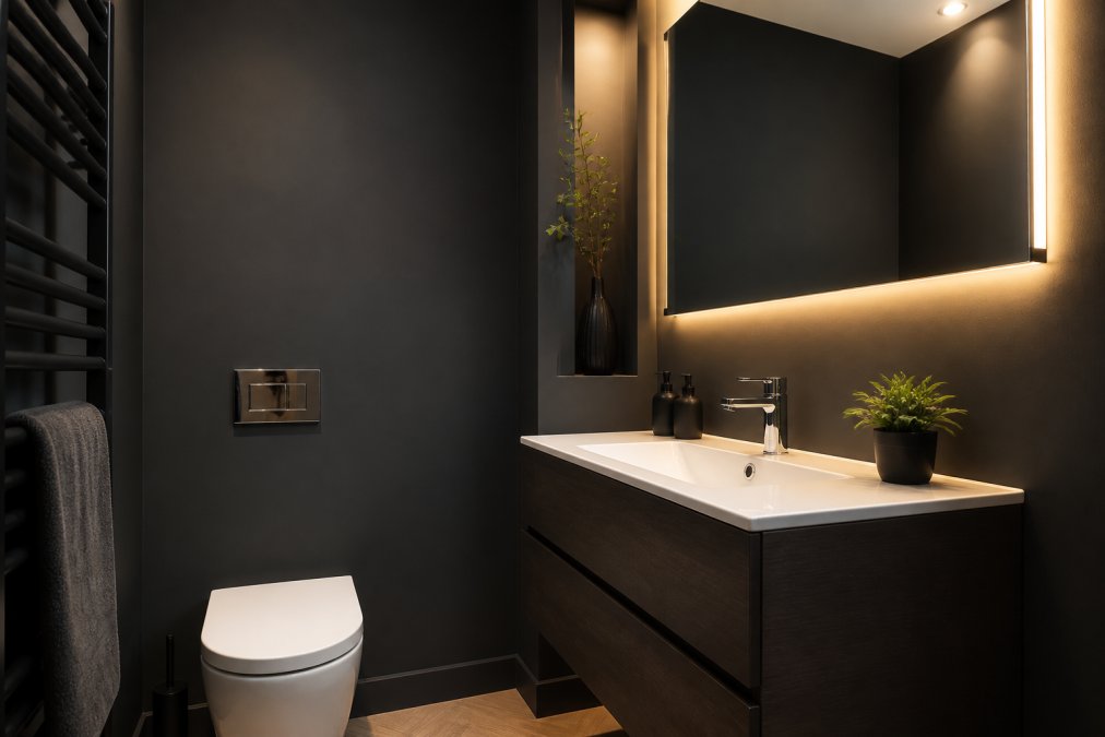
Charcoal, espresso brown and deep slate are the boldest schemes in this list, and the ones that most often go wrong. The rule that saves them: dark colours need contrast and light, not more darkness.
Why Dark Schemes Fail (and How to Stop Them)
A dark bathroom fails for one of three reasons, each with a different fix.
- No contrast. A charcoal wall against a charcoal floor against a charcoal vanity removes every edge the eye uses to read depth. Fix: keep at least one large surface pale, a white basin, a pale stone-effect floor or a light timber vanity.
- One light source. Dark surfaces absorb far more light than pale ones, so a single ceiling fitting that flatters a white bathroom leaves a dark one feeling like a cellar. Fix: layer the lighting. An overhead fitting, a mirror light and one warm accent (a wall light, a shelf strip or a lit niche) is the minimum; three layers is where a dark room stops feeling oppressive.
- The wrong finish. Gloss dark tiles and panels bounce light and show every water mark and smear. Matt dark surfaces hide marks better but absorb more light. The compromise: matt on the walls, gloss or polished on the floor or a single feature, so the room still catches reflections.
Contrast, Trim and the Details That Make It Work
Dark schemes live or die on their trim. Chrome and polished nickel read as sharp and contemporary against charcoal; brushed brass and bronze read as warmer and more traditional. Pick one metal and repeat it on the tap, the shower, the towel rail and the door handle. Mixing three metals in a dark room looks accidental rather than layered.
Dark Palettes and Room Size
Dark colours do not automatically shrink a room, but they change how it is read. In a large bathroom with good natural light, a full dark scheme feels hotel-like and deliberate. In a small internal room with one small window, the same scheme feels tighter unless the contrast and lighting rules above are followed strictly.
Maintenance Reality
Dark matt surfaces are forgiving of water marks and limescale compared with white or pale grey, a genuine advantage in hard-water areas. The trade-off is dust and soap residue on horizontal surfaces, which show up more clearly against a dark background. A quick wipe of the shelf, cistern top and window ledge is part of living with a dark scheme.
Modern Bathroom Designs for Small Spaces
Small bathrooms force a colour decision large ones don't: whether to embrace the size or disguise it. The current consensus favours embracing it, using monochromatic schemes in a single tone to remove visual breaks that make a room feel chopped up.
How Colour Changes Perceived Space
The mechanism explains why some small-room advice contradicts itself. Colour affects perceived depth through two levers: value contrast and saturation.
Decorwall Classic-Green Marble Wall →
- Low value contrast (walls, ceiling and floor within a narrow band of light-to-dark) removes the visual edges where surfaces meet, so the eye travels further before hitting a boundary. This is why an all-oatmeal or all-sage room reads larger than the same room with a white ceiling and a dark floor.
- High saturation pulls a surface forward. A strong navy or forest green wall feels closer than a pale one, useful on a single feature wall, but closing if applied to every surface in a tight room.
- Cool hues recede, warm hues advance. This is a general tendency rather than an absolute rule, easily overridden by contrast and lighting. A warm oatmeal room with low contrast still feels more open than a cool blue room with a dark floor and bright white ceiling.
Monochromatic Without Monotone
Monochromatic does not mean monotone. Vary the finish instead of the colour: matt walls, gloss panels, a textured floor. Keep the largest surfaces (walls and ceiling) in the same tone and finish, then introduce one contrasting finish on a smaller plane, such as a gloss panel inside the shower or a textured floor.
Panel Width and Small-Room Geometry
Panel width matters here too. Narrow 250mm panels create more joints, but in a tight ensuite those joints help, breaking a long wall into readable sections and reducing waste on awkward cuts. Wider 900mm panels suit larger runs where fewer seams look cleaner.
Colour and Accessibility
This angle matters if the bathroom needs to work for someone with reduced vision or limited mobility.
- Contrast for safety. Grab rails, shower seats, taps and door handles should contrast clearly with the surface behind them. A chrome rail on a pale grey wall is a common, avoidable hazard; a brushed brass or matt black rail is far easier to locate.
- Avoid full high-contrast schemes. A black-and-white bathroom is striking but disorienting for someone with low vision, because the eye struggles to judge depth across sharp tonal jumps. Mid-tone palettes with moderate contrast are easier to navigate.
- Matt over gloss. Glossy floors and walls produce glare and reflections that can be confusing. Matt finishes reduce this, though they need more frequent cleaning.
- Consistent tone across surfaces. Keeping walls, floor and fixtures within a moderate tonal range helps someone with reduced depth perception judge where surfaces begin and end.
Budget-Friendly Updates
Not every small-bathroom refresh needs a full renovation. The lowest-cost changes that shift a palette most, in rough order of impact per pound:
- Paint or panel one wall. A single feature wall in a new tone changes the room's read for a fraction of a full retile.
- Swap the hardware. Taps, towel rails, cabinet handles and a shower head in one new metal can shift a scheme from chrome-cold to brass-warm in an afternoon.
- Replace textiles and accessories. Towels, a bath mat, a shower curtain and a soap dispenser in a coordinated tone are the cheapest way to test a palette before committing.
- Add a mirror and a second light. Both increase perceived space and cost far less than structural work.
Best Paint Colours for Small Bathrooms
The best paint colours for small bathrooms are soft mid-blues, sage green and oatmeal beige, applied across all four walls rather than as an accent. High-contrast schemes shrink a room; low-contrast schemes let the eye travel further.
Three practical rules:
- Keep walls and ceiling within two shades of each other
- Use one accent colour maximum, and keep it to a single surface
- Choose eggshell or moisture-resistant finishes, not standard matt emulsion
Bathroom Wall Panel Colour Trends for 2026
Panel colour trends for 2026 mirror the paint palettes above, with marble effects in beige, grey and green leading demand. The advantage over paint is durability: no repainting after steam damage, no grout lines to scrub, and a wipe-clean surface that holds its colour.
| Palette | Best For | Panel Option | Price |
|---|---|---|---|
| Earthy neutrals | Small ensuites | Decorwall Classic-Rose Marble (250mm) | £11.00 |
| Nature greens | Accent walls | Decorwall Classic-Green Marble (250mm) | £11.00 |
| Soft blues | Spa-style rooms | Decorwall Elite Print Arctic Grey | £11.00 |
| Terracotta accents | Feature splashbacks | Decorwall Maxi Panel Beige Marble (900mm) | £54.00 |
| Dark and moody | Larger bathrooms | Decorwall Elite Print Storm Grey | £11.00 |
Frequently Asked Questions
What are the best bathroom colours for 2026?
Earthy neutrals such as oatmeal beige and clay pink lead for 2026, followed by sage green and soft mid-blues. Deep tones like charcoal and espresso brown are also popular for creating a spa-like feel. If you want a low-commitment update, choose wall panels in these shades rather than repainting tiles, as panels are 100% waterproof and need no grouting.
What are the best paint colours for small bathrooms in 2026?
For small bathrooms, light and airy shades work best: soft mid-blues, powdery greens, and warm off-whites. These colours reflect light and make the room feel larger. Avoid very dark shades on all walls unless you balance them with plenty of white or mirrors. If you prefer a deeper colour, use it on a single accent wall behind the basin or shower.
Is grey still a popular colour for bathrooms in 2026?
Grey remains a practical choice, but the trend has moved towards warmer greys and greige tones rather than cool, flat greys. Pair grey with natural wood, matte finishes, or brass fixtures to keep it feeling modern. Grey wall panels, such as the Decorwall Elite Print in Storm Grey, offer a durable way to use this colour without repainting.
How can I use wall panels to incorporate 2026 colour trends?
Wall panels come in a range of colours and finishes that match 2026 palettes, from earthy marble effects to matte grey and green tones. Panels are quick to install over existing tiles, are 100% waterproof, and need no grouting, so they suit DIY projects. Look for tongue-and-groove panels in widths like 250mm for smaller rooms to minimise waste.
How do I choose a colour palette for a small bathroom?
Start with a light base colour for walls, then add one or two accent shades. Consider the room's natural light: north-facing rooms benefit from warm undertones, while south-facing rooms can handle cooler hues. Use colour to draw the eye upwards, for example by painting the ceiling the same shade as the walls. Test samples in different lights before committing.

